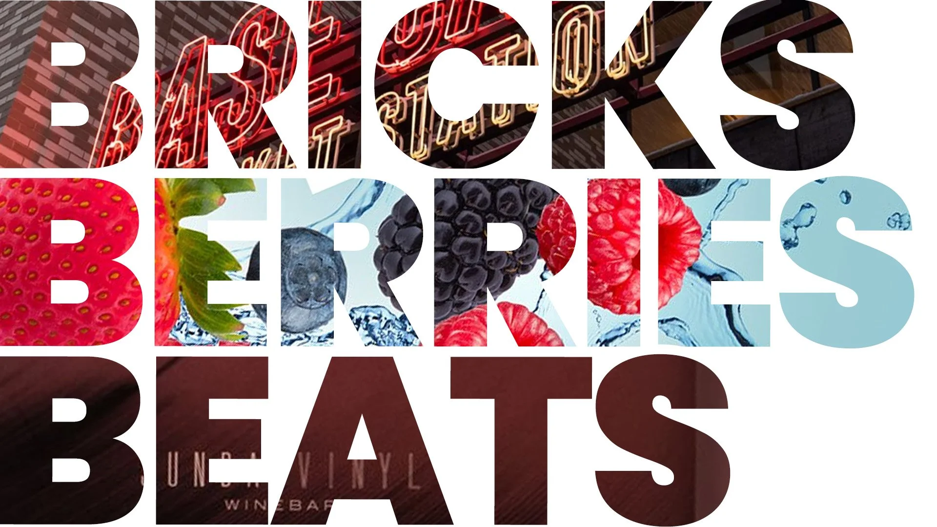
What We’ve Learned Building Brands Across…
Working on a skyline-shaping development one week and a grocery-aisle breakout the next will stretch your brand muscles in multiple directions. But if there’s one thing we’ve learned at Merrick Creative, it’s this: smart ideas travel. The tactics that grab attention in a crowded retail shelf often work just as well wrapped around a construction site. Food brands teach us to get to the point (and fast), while real estate reminds us how much the long game matters.
Here are five lessons that keep showing up across our work in real estate, retail, and food & bev—and why they matter no matter where your brand lives.
1. One strong why beats any list of features
When we branded Market Station, a full city block in downtown Denver, we didn’t lead with square footage or amenity counts—we led with a story. “The Epicenter of Urban Life” became our rallying cry, wrapped in orange neon and visible from blocks away. It worked. People got it before they even walked in.
At The Oak, a boutique condo in Falls Church, we found a similar sweet spot. Instead of trying to out-luxury the luxury market, we positioned the building at the intersection of modern progress and old-school charm. Suddenly, it wasn’t just another nice place to live—it meant something.
Lesson learned: If your brand doesn’t know what it stands for, your audience won’t either. A tight narrative will beat a brochure full of bullet points every time.
2. Packaging is just wayfinding with a tighter deadline
Hope Nut Dips needed to stand out in a sea of hummus. So we reworked the lids to call out flavor and ingredient quality—big, bold, and fast. It worked: sales soared, and retailers like Publix and Target started calling.
With Branch & Barrel Whiskey, we used that same packaging logic to create shelf appeal that felt handmade and heritage-rich. Think oak textures, batch numbers, and just enough grit to earn a spot in someone’s home bar.
Whether you’re designing a whiskey label or a wayfinding system for a new development, the job is the same: make sure people know where they’re going—and feel good about getting there.
3. Personalization isn’t a luxury anymore—it’s the baseline
Beacon 85 in Denver was made for the weekend warrior: ski-friendly, dog-friendly, and filled with nods to mountain culture. We built a brand that felt less like an apartment complex and more like a launchpad for adventure.
Scott’s Collection in Richmond took a different approach. Instead of one big building with a generic name, we created three unique personalities—Ink, Viv, and Gem—under a shared umbrella. Residents could pick the vibe that fit them best while still feeling like part of something bigger.
Then there’s Naturipe—a berry brand most people hadn’t heard of (despite it being one of the biggest in the world). We helped them shift from grower to storyteller, with messaging that felt personal, friendly, and human. Whether it was a berry hack or a sustainability stat, every piece of content felt like it came from someone you trust—not a faceless ag giant.
Point is: People don’t want generic. They want brands that speak to them—whether they’re picking a home or a pint of blueberries.
4. Honesty wins
J.W. Johnson Chili had one of the best origin stories around—they supplied meat to Chipotle in the early days—and a product that was clean, gluten-free, and preservative-free. But nobody knew. So we built the brand around those truths. Suddenly, it wasn’t just another chili—it was your chili.
Maple Guild did the same by shouting their steam-crafted, single-source maple process from every bottle. The result? Shoppers felt like they were buying from a Vermont sugar shack, not a big factory.
Developers can take a page from that playbook, too. Want residents to trust you? Show your sustainability data. Explain your energy use. Be transparent about operating costs. People appreciate honesty—especially when they're signing a lease or spending $14.99 on a bottle of syrup.
5. Brand consistency isn’t sexy—but it is everything
Sunday Vinyl is a train-platform wine bar where everything—menus, playlists, Instagram posts—feels like it came from the same analog hi-fi world. It’s weirdly cohesive, and that’s why it works.
We brought that same discipline to Naturipe, a brand that had 100 different voices across its channels. We helped them streamline messaging across advertising, social, retail partnerships—even trade shows. Now whether you're seeing a grower story on LinkedIn or a sustainability fact sheet, it all feels unmistakably Naturipe.
The win: When every touchpoint hums the same tune, people start to sing along.
So what ties it all together?
Whether we’re branding a building, a bottle, or a neighborhood, the same rules apply:
Be clear. Be consistent. Be useful. Be human.
And when in doubt? Add flavor. Literal or otherwise.
Got a project that lives on the street, in the store, or somewhere in between? We’d love to build it with you.